|
|
|||||||||||
|
|
|
Color Choosing combinations
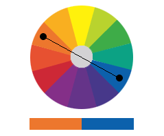
Newspaper and magazine advertisers often believe that choosing colors requires a special sense or skill only possessed by design experts. What designers don't tell you is that choosing colors and color combinations is a very logical, almost mathematical process, and we'll show you just how easy it can be. Light can be broken into three primary colors—red, green, and blue. All other colors are created by mixing these three primary colors together. A color wheel displays both the primary colors and many of the colors that can be created from mixing them.
This might not seem very useful, but it's an invaluable tool in helping determine what colors work well with each other. Pick any two colors on the wheel that are opposite each other (complimentary colors), and they'll look right together.
You can also choose colors next to each other on the wheel (analogous colors), and they'll be harmonious as well.
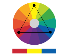
Choose any three points equidistant on the wheel (triad colors),and they'll also produce harmonious and striking combinations.
But where in your ad should you be using color? That's what we'll talk about next. Next: Where to use color
|
 |
||||||||||||||||||||||||||||||||||||||||||||||||||
| Home | Contact Us | Online Seminars | Hire A Speaker | About This Site |
|
Conditions of Use © 2001-2004, Design Your Ad |