|
|
|||||||||||
|
|
|
Ascenders and descenders
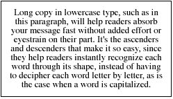
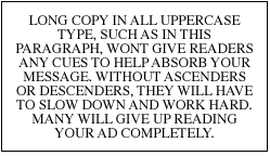
Besides using readable typefaces, make sure to use both upper and lower case letters. While some may believe that type set in all capitals would make it stand out and emphasize the message, often this results in the opposite effect. Shortly after all of us learned to read, we stopped deciphering words by looking at their individual characters and started learning their word shapes, based on the word's ascenders and descenders found on the lowercase character set. Ascenders are the parts of some characters that hang below the line of type, as in the lowercase letters p, j, g, and y. Descenders are the opposite, with parts of these characters rising above the rest, as in the lowercase letters b, d, t, and f. Lowercase letters such as a, o, e, n, and m have neither ascenders nor descenders.
You can see for yourself how much easier upper and lowercase type helps get your message across. Read the copy in the box above, and then try reading the copy in the box below.
It's no surprise that virtually every English-language newspaper, magazine, and book is set in upper- and lowercase type. Next: Width of columns
|
 |
|||||||||||||||||||||||||||||||||||||||||||||||
| Home | Contact Us | Online Seminars | Hire A Speaker | About This Site |
|
Conditions of Use © 2001-2010 Robert McInnis Consulting |